“I was honoured to be asked to judge this year’s AAUP Book, Jacket, and Journal Show. And, it was such a pleasure to meet my fellow designers—Andrew, Emmet, and Maia—and spend several bitterly cold days happily inside studying this year’s entries together. We came from different places—in design, in life, and in the world—yet found such common ground through our love of books, our appreciation for good design, and our affinity for university presses.
Books are physical objects holding their stories inside, creating a sense of permanence that has always resonated with me, and which led to my love of book design (in addition to it being my first job offer in New York City so many years ago). I still find myself spending hours in small bookstores poring over books and their covers, feeling their laminations and finishes, smiling at the small details of deckled edges and cloth bindings and lovely typography and clever ideas, and of course, always turning them over or opening them up to find a designer’s name. I sure any book designer would relate; perhaps they do the same thing? It’s why I feel printed books will always exist, despite the presence of ebooks. I know that whenever I have conversations with bookstore owners, this always comes up.
But here, we tried to stay objective and evaluate the design. Did we understand what the book was about? Did the cover have the right mood? Was it well-executed? Was it aesthetically pleasing? And as always with university press designs, was the concept there? There are many things to keep in mind while looking at university press designs, such as less-than-perfect imagery provided, production constraints, and heavy subject matter, but overriding all of these things is the fact that good design is good design.
I feel good about our choices: our winners stood out to us for their clear messages, well-though-out designs, and beautiful executions.
I wish to thank Nathan, Jeff, and Kim for all of their guidance and support during the judging and the AAUP for continuing this wonderful traditional of celebrating university press book design.” —From the Association of American University Presses’ 2014 Book, Jacket & Journal Show catalogue.
Kathleen Lynch started Black Kat Design, a one-woman design studio specializing in book jacket design, in 2006. Having earned her BFA in graphic design from the University of Connecticut School of Fine Arts, she began her career as a cover designer in New York at Random House, starting in mass market and expanding to trade paperback and hardcover design. Working next as designer/art director at Carol Publishing, she then went on to art direct that trade list at Oxford University Press. Along the way, she has designed hundreds of book covers and won acclaim. Her work combines a love of books, a passion for typography, and an eye for the unusual.
*
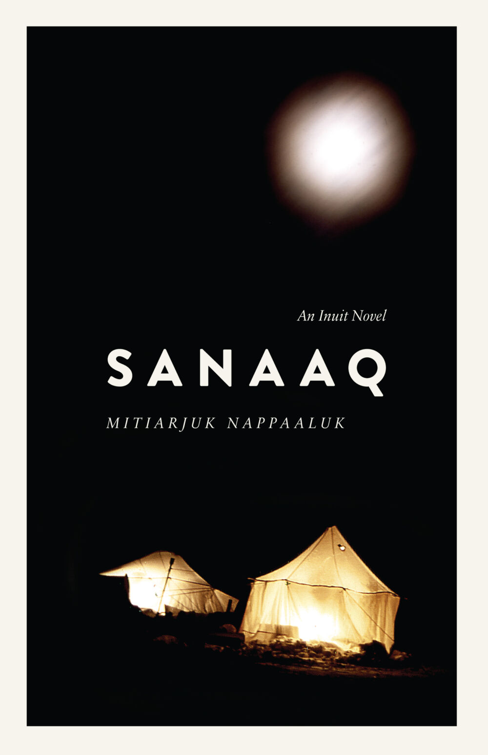
“Love the font choice visually, especially the Q. Also like how in a subtle way it reflects the syllabic alphabet that the author used to write her story. Border makes it feel more like a package and visually echoes the type. Evocative photograph.” —KL on Mitiarjuk Nappaaluk’s Sanaaq.
*
“Sanaaq: An Inuit Novel is UMP’s first foray into publishing literature, and we wanted to make it clear through the book’s design that this was a unique part of our publishing list. The smaller trim size (5.5” x 8.5”, rather than 6” x 9” used for our standard monographs), ragged fore-edge, and cover flaps signal our literary pretensions from the outside. Inside, the generous spacing at the beginning of chapters and wide margins continue this style, and convey the sense of open space evoked by the cover photo.
The cover image (taken by Yaaka Markusie Yaaka) is a contemporary photo from an Inuit community in northern Quebec. Still, the 2004 image shares the intimacy of the family and community story in the novel, and suggests the openness and isolation of the Arctic landscape. The tent in the photo is of a traditional style that would have been used by Mitiarjuk Nappaaluk and her family, and Nappaaluk would have done much of her writing in such a tent.”
Glenn Bergen
Managing Editor